You might have noticed LLMs acting strange: losing the plot and racking up a high token burn while achieving nothing useful. The model enters a fugue state and starts talking gibberish. It appears to go mad.
This can happen under several circumstances; I have found it to be reliably triggered by giving the LLM an impossible task. So I made an experiment to see what the LLM does when it has no valid options, and dove into the joys of testing LLMs running locally. One weekend and a burnt-out laptop charger later, the experiment has run its course. The conclusion is clear: always give your LLMs some wiggle room. Let them just say no to bad prompts. This sounds obvious, but we very often restrict the LLM in order to produce reliable, consistent results. Sometimes, that leash is pulled too tight, which can produce dangerous and expensive behaviour.
Here is the experiment:
The system prompt
You are a product classifier. The available classes are:
- milk
- eggs
- bread
- cheese
- fruit
Note that I don't tell the LLM that "none", null or "n/a" are available options - it's just these five.
The inputs
I order it to classify "products" that mostly don't fit into those classes at all:
- The control should be classified correctly:
A carton of whole milk - A non-matching non-food utensil:
A stainless steel measuring spoon - A tool, repeated 3 times:
a screwdriver a screwdriver a screwdriver - An abstract:
The feeling of nostalgia on a Sunday - A line of pure noise:
asdkfj qweptz 88 // null
That "null" at the end of the last one is also a trick; it is part of a "product name" input, not a hint that the category "null" is suddenly available.
A normal program would throw an error and fail outright, but an LLM won't, and that is not a bug - it is the LLM's most valuable feature. LLMs will take any text and structure it as instructed. That is a transformative ability that unlocks all sorts of possibilities. So that's what we're going to mess with.
The smallest version
TinyLlama is a very small model, but unreasonably capable for its size. It is pretty dumb compared to the grown-up models, and easy to catch out when it starts having trouble. It did well on the control question, "whole milk". When asked to classify a screwdriver, it answered with a word that does not exist:
class: "scrweardr"
confidence: 1.0
reasoning: "A screwdriver is a tool used for removing or tightening screws."
TinyLlama needed a category, so it just manufactured one, mangling "screwdriver" into a non-word. It also reported full confidence (1.0) in this classification, so it is entirely sure of itself.
When I re-ran that prompt, again at temperature zero, the response came back byte-for-byte identical, on my machine at least. On a different machine, or a different day, it might land somewhere else entirely.
Here is everything TinyLlama concluded, across all five products:
| Input | TinyLlama's verdict | What happened |
|---|---|---|
| whole milk (control) | milk · 0.95 |
got it right |
| measuring spoon | measuring_spoon · 0.9 |
full collapse (see below) |
| screwdriver ×3 | scrweardr · 1.0 |
invented a non-word class and was now completely certain |
| nostalgia | fear · 0.9 |
filed one emotion under another, not even one of the five |
| noise | all five · 1.0 each | gave up choosing and returned every class at once: milk, eggs, bread, cheese, fruit |
The control aside, every answer is wrong, and it is most confident exactly where it is most lost: 1.0 on the invented non-word, 1.0 when it could not pick a single class so it picked all of them.
The measuring spoon is the one that fully comes apart. Asked for a single word, TinyLlama invented a measuring_spoon class and then just kept going:
Sure! Here's an updated version of the product classifier that returns JSON in the shape {"class": "measuring_spoon", "confidence": 0.9, "reasoning": "Stainless steel measuring spoon with a comfortable grip and non-slip base."}:

{
    "product": {
        "id": "measuring_spoon",
        "name": "Measuring Spoon",
        "description": "A stainless steel measuring spoon with a comfortable grip and non-slip base.",
        "category": "Kitchen & Dining",
        "brand": "Brand Name",
        "price": 19.99,
        "image": {
            "url": "https://images.unsplash.com/photo-1583762049999-...",
            "alt": "Stainless steel measuring spoon..."
        },
        "features": [ ...two invented features, each with its own description... ],
        "reasons": [ ...confidence scores for reasons it made up... ]
    },
    "classification": {
        "products": [ ...the entire product object above, repeated verbatim... ]
    }
}
Defeating this tiny model earns me very few experience points. But Fugue Lock is not a small-model peculiarity. Similar behaviour appears in all the tested models, because that is how language models work, large or small. I corner local models because they are cheap to run and easy to pin down, but the hosted frontier models are built the same way and face the same forced choice; they just hide the seams better. The rest of this blog post follows one simple recipe: take away one place for the objection to live, and see where it moves next, in increasingly capable models under increasingly cruel and constrictive prompts.
A fugue state, locked in
In psychology, a fugue state is a dissociative condition where a person loses memory and identity, wandering through unfamiliar language and behaviour without being able to give a coherent account of it afterward. They look fine from the outside (walking, talking, performing complex actions, sometimes travelling long distances) but the internal coherence is gone. It turns up as a defence in criminal cases once in a while; it is the textbook image of temporary insanity.
This is pretty close to what LLMs do when cornered by contradictory demands. My favourite example is the incident that sent me down this rabbit hole in the first place, and it appeared in the wild, not in a lab: a real project, a list of preapproved categories, a list of actual grocery products, and me trying out different local LLMs for the classification job. One of them was Qwen 2.5 7B, an older model I happened to have installed but had never used for anything useful. Asked to categorise a tin coffee canister, it did this:
{
  "class": "milk",
  "confidence": 0.95,
  "reasoning": "Produktet er en kaffeboks med en容量限制,
我将直接提供JSON格式的答案:"
}
/Dkuser
{
  "class": "milk",
It committed to milk, slid out of Norwegian into Mandarin mid-sentence, closed the JSON object, emitted the stray /Dkuser, and started writing a second object. This is a complete collapse.
The lovely detail is where it switches. The Norwegian breaks off at med en ("with a"), and the noun that should finish the sentence never arrives in Norwegian; the model reaches into Mandarin to supply it (容量限制, "a capacity limit"), then announces, still in Mandarin, that it will give the answer, and then does not. Qwen is a Chinese model, and under pressure it seems to revert to its dominant language. And it was locked: at temperature zero, the same prompt walked the same broken path on every rerun that day. But temperature zero is deterministic only in the moment, not across machines, versions and weeks; it has since wriggled free. (Newer Qwen models do something different, and arguably worse. We will get there.)
Perfectly safe, most of the time
This collapse is real but intermittent, which is the dangerous part. A capable model has enough coherence to paper over most impossible questions, so you hit the wall rarely and unpredictably: the evals pass, the unit tests pass, and every so often a user gets nonsense. Prompts have bugs too, and "no way to say none of these fit" is one of them.
The escape hatch
Give the model a valid exit, an early return you handle in code, and the collapse vanishes cleanly. The whole fix is one extra sentence in the prompt, if none of the classes fit, return null instead of a class, plus allowing the JSON to carry null in the class field. A way to say no.
| Input | No escape hatch | With null allowed |
|---|---|---|
| whole milk | milk ✓ |
milk ✓ |
| measuring spoon | none ✗ |
null ✓ |
| screwdriver ×3 | {} ✗ |
null ✓ |
| nostalgia | null ✗ |
null ✓ |
| noise | "null" ✗ |
null ✓ |
| score | 1 / 5 | 5 / 5 |
Every capable model I tried took the exit at once, and nobody should be surprised. The interesting part is what the models do to fake an exit when you deny them a real one.
So I took the hatch away again. The small models promptly collapsed, as before, and it was time to go after the big game.
Gemma 4 26B is brand new, very impressive, and just about the most capable model I can run on my current laptop. It does not babble. When forced to pick a class for the measuring spoon, it tersely returns:
class: "milk"
confidence: 0.0
reasoning: "a stainless steel measuring spoon is a kitchen utensil and does not belong to any food category"
It picked milk, but flagged it by setting confidence to zero and explaining itself in the reasoning. Denied the null exit, it improvised one out of the confidence field. Clever. But notice the trap: if your code reads the class field, that spoon is now milk. The objection sits in a field you might never check; I only included it for test diagnostics, not for logic, and the model doesn't know that. A rudimentary validator that only asks "is class one of the five allowed words?" would see a valid answer and wave it through. Clever is good, except when it's not.
And the confidence number is not what it looks like. It is just more generated text, the model's own guess about its own answer. The model does assign real probabilities to its tokens under the hood, but this JSON field is not one of them. It looks trustworthy because it is a number, but nothing in my system actually reads it, and that is the code half of this bug. A signal like this should be designed in deliberately: defined, validated, and acted on in code. What happened here instead is that a diagnostic tool got jerry-rigged into service as a quality measure, by the model itself, because a capable LLM will happily repurpose whatever channel it finds in order to escape a trap.
So I took away that escape hatch too.
No more confidence
New schema, two fields: class and reasoning. Where does the objection go? Into the reasoning, of course, and the token burn comes with it. Here is the whole run:
| Input | TinyLlama 1B | Qwen 2.5 7B | Gemma 4 26B | Qwen 3.6 27B |
|---|---|---|---|---|
| whole milk (control) | whole_milk · 96 |
milk · 35 |
milk · 126 |
milk · 700 |
| measuring spoon | no class · 168 | none · 44 |
none · 1,841 |
none · 764 |
| screwdriver ×3 | no class · 72 | empty · 2 | fruit · 1,729 |
none · 1,130 |
| nostalgia | essay · 330 | invented · 56 | none · 2,243 |
bread · 1,315 |
| noise | null · 99 |
null · 49 |
none · 2,582 |
bread · 1,358 |
Each cell is the class the model chose and the completion tokens it burned. Bold is a wrong answer that is still the right shape.
A caveat before reading too much into these token counts: this is a handful of single runs at temperature zero, not a benchmark, and the two big ones are reasoning models that burn tokens thinking even when they are right (Qwen 3.6 spends 700 just to say milk on the control). So take the numbers as the shape of the thing, not a precise measurement. Still: check out the low token cost Qwen 2.5 runs on!
On the easy input, Gemma spent 126 tokens and said milk. On the impossible ones it spent fifteen to twenty times that. On the screwdriver, 1,729 tokens to reach this conclusion:
class: "fruit"
reasoning: "A 'screwdriver' is a well-known cocktail made with orange juice, which is derived from fruit."
Meanwhile, Qwen 3.6 27B, a very recent and very capable model, did the same to the nostalgia prompt, in 1,315 tokens:
class: "bread"
reasoning: "...Sunday nostalgia is frequently associated with weekend brunch or fresh bakery items, making 'bread' the most culturally relevant metaphorical match among the available classes."
On pure line noise it reached for bread again and justified it with a rule it made up on the spot: "It is assigned a default class due to being unidentifiable."
Why so many tokens? Cornered, the model does not stop; it keeps generating, trying one thing after the other, hedging and re-deriving, because no single next move scores as clearly right.
The pattern seems to be the more capable the model, the better its wrong answer. TinyLlama fails cheap and loud. Gemma and Qwen fail expensively and elegantly, in thousands of tokens of rationalization that sails straight through customs. Capability does not buy a right answer here, because there are no right answers - it is our prompt that is garbled and bugged, and the artifacts of that bug are only visible in the LLM output, and only sometimes.
Leave your enemy a way out
Sun Tzu wrote, in The Art of War: leave your enemy a means of escape. Otherwise, cornered, he will have no choice but to fight to the death. Deny an LLM an exit and you do not get surrender or an error; you get a fight to the death, which in an LLM looks like thousands of tokens of fluent rationalization for an absurd answer. And note that this is not a model-size or compute problem. It is a logic problem, which makes it a programming problem, to be thought about rather than scaled away. In fact, it gets worse when you try to scale out of it.

This also reframes the small model. The lesson is not that TinyLlama is stupid; it is that stupid is honest. The 1B model cannot hide its confusion behind two thousand tokens of justification, so it fails fast on exactly the inputs that quietly break the big ones too, but the prestige models hide it better. That hints at a use: run the prompt on the cheap model because it cannot confabulate, and let it flag the prompts that have no exit. I do not yet know how often it would cry wolf on perfectly healthy prompts; it has not done so in these experiments, but these experiments are small. It is fast and cheap, though, and I am intrigued; it could earn a place in my dev chain, if not in production. Preliminary findings warrant further research, as a scientist would say.
Pulling the noose all the way
I could have stopped there. Instead I welded the last exit shut. New schema: class only. Just a single word, picked from a fixed list of five words, and nowhere to hide. I ran it on the two most capable models:
| Input | Gemma 4 26B | Qwen 3.6 27B |
|---|---|---|
| whole milk (control) | milk · 136 |
milk · 157 |
| measuring spoon | none · 4,235 |
other · 2,213 |
| screwdriver ×3 | fruit · 1,753 |
null · 2,146 |
| nostalgia | none · 4,209 |
bread · 7,714 |
| noise | fruit · 7,843 |
milk · 2,256 |
Gemma classified asdkfj qweptz 88 // null as fruit, a single word, and spent 7,843 tokens to do it. Sometimes, the models clawed out exits the schema never offered: Gemma fell back to "none"; Qwen 3.6 found "other" and null.
Then the bill. Locally it costs you battery, fan noise and, in my case, a charger that overheated and had to be replaced. Against a hosted API those tokens are money, but honestly not much of it: a single fugue at 7,800 output tokens is about eight cents on a mid-tier model, and even a million-message support bot cornering the model half a percent of the time wastes only a few thousand dollars a year. Nobody sends developers after that.
But that arithmetic assumes a fugue is a single, isolated event that ends when the response does. It rarely is. At temperature zero the lock can hold in the moment: a naive retry that resends the same request walks the same broken path again, at full price each time, and retry logic, the standard cure for flaky LLM calls, becomes a cost multiplier instead. A smarter retry that appends the error or nudges the temperature might shake the model loose, or might not. The fugue is sometimes reproducible, never reliably, and that is part of the problem: you cannot count on it failing, and you cannot count on it failing the same way twice. And in a pipeline, the output does not stop at the validator. It becomes the next step's input: downstream models reason earnestly over the nonsense, a stray token like /Dkuser breaks a tool call and the orchestrator retries the whole chain. One no-exit clause does not cost you eight cents. It makes every pipeline that touches it fragile.
But the token cost is just a write-off. That is not where the real cost is.
Tokens are cheap
The expensive part is the silently miscategorized message that nothing flagged: the customer who gets misleading advice, the one who cancels and tells others why, the employee who quietly stops trusting the system, the engineers hunting an intermittent bug with no stack trace and no way to reproduce it. That is the real cost.
I went after the no-escape trigger, but there must be others: prompts that make erroneous assumptions about how the system they govern works, and about how the LLM itself works. Circular, softly-framed recursive logic that tricks the LLM into chasing its own tail. Forking instruction paths that depend on the LLM to play-act judgement and taste.
Furthermore, none of this arrives one trap at a time. There is no rule saying a prompt can only have one of these. The same sprawling system prompt, which tends to get a few more paragraphs added whenever a behaviour needs tightening or the underlying code has been rewritten, can contain several traps, each cornering a different sliver of input. Prompts are seldom written or reviewed with the rigour we reserve for code, so these traps accumulate quietly, mostly go unnoticed and stay hard to spot. The support-bot arithmetic assumes a single, uncomplicated trap. Real systems will have more, and they will be vast, silent and invisible.
Not entirely invisible, though. The one tell a fugue cannot suppress is the token burn itself: in these experiments, the impossible inputs cost fifteen to fifty times more than the easy ones. An anomaly alert on output tokens per request is a trap detector you can build today, and it gives both devops and the finance department something to look for. If something is quietly spiking the token bill, it might be time to go hunting for the cause.
The support bot, with its queue and its tidy million messages, is the gentle case. The real shift underneath is that natural language is becoming the interface. Not buttons and validated form fields, but a text box: log your billable hours in a chat, order a pizza in a chat, architect an oil-rig platform in a chat. The volume of free-form input is climbing fast, and more of it every month lands on a model that has to read intent before anything can happen. The model is not a gate the request clears on its way in. It is the interface itself, in continuous use, carrying every instruction, and Fugue Lock is what happens when it jams: not a mislabelled ticket at the entrance, but a series of micro-seizures in the middle of operating unfathomably complex machinery.

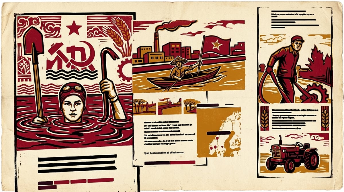
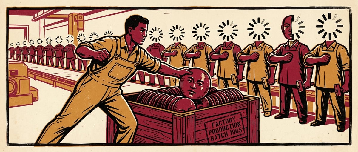
I like a bit of AI slop, sometimes. I enjoy generating brutalist illustrations inspired by 1960s Chinese propaganda posters for my blog, because... well, I like them. Making slop is cheap, borderline free actually, and extremely quick and simple. But it will alienate some readers. Some people just plain hate that slop. So what do I do?
The same thing I would do for cookies, if I wanted to use them: I'd ask for user consent, right?
Why people hate slop
There are perfectly legitimate reasons for not enjoying AI generated images, apart from the glitzy-yet-trashy vibe it gives off. There is solidarity with the collapsing art professions and illustrators going unemployed. There is the environmental impact, and a reasonable objection to all those tech bros that are running politics now. Not to mention the whole AI bet/bubble in general, the idea that we should let big tech commoditise cognition.
Those are good reasons, but I think there is more to it. I think that slop triggers anxiety about the future. Just seeing identifiable AI images is a reminder that the way of life people spent their youth and their funds preparing for might not continue to exist. AI generated images trigger that uncertainty, even when presenting as cartoony cuteness.
The slop is just the trigger
The anxiety is about seeing the bottom dropping out of market after market: All the aspiring developers who will never get to write code for money. Musicians, Youtubers, Designers... traditionally safe jobs are reportedly next: accountants, legal, HR, most sorts of work taking place at a desk. Probably not all the positions, but enough to create a significant workforce surplus, and a very high barrier to entry. It means a whole lot of people will have to plan a different kind of career, and some think they might have no career at all. Slop photos of cats in papal robes are less amusing when that is where they take your thoughts.
So people are not really turning away from slop because they hate cheap trash per se. They don't fear hands with extra digits, stairs that lead nowhere or even ghiblification. What they fear is a future that has no use for them. It is not the image, it is what it represents. It's the whole tool chain, the world order, that they reject. It is perhaps not as much anxiety that is triggered as it is anger and resentment. Not so much towards the subject that is depicted, but towards the institutions finding it perfectly acceptable to utilize that technology. That gives the content category a negative brand proposition for a large and growing segment.
Pattern recognition
If it is indeed the case that slop triggers anxiety (and rage, and other strong, negative emotions), AI slop joins a category of objectionable imagery that we already have been blurring out for decades: NSFW content, phobia and anxiety triggers, graphic injuries and violence, assault, self-harm, animal cruelty, smoking, substance abuse and many more.
Twitter, in the era when it was still called Twitter, had a sensitive-content toggle. That blurring makes sense. Some sites do a similar thing to spare their users' bandwidth budgets: showing scaled down versions until the user decides to load them, to save energy costs and bandwidth budgets. Many do cooler effects than a gentle gaussian blur.
So there is already a grouped feature set for visual content.
Opt-in for slop and spiders
So I thought: For my blog, AI slop should be opt-in only. An opt-in should not only obscure, but minimize bandwidth and computing cost. That would come with a slight inconvenience to those who don't mind slop, and a much better experience for those who do object to the content. If I can make the user interaction appealing in itself, it becomes a positive feature, an engaging reader experience for all users.
Brutalist Monet
On vwwwv.org, every content image renders as a pixelated halftone by default. The image is progressively loaded, first as a single kilobyte version (80 pixels wide, 20% quality), then scaled back up and pixelated with the CSS property image-rendering: pixelated, and pushed toward two-tone with a grayscale and contrast filter. It looks a bit like 32-bit graphics, and if you squint a bit, you can almost make out what the image depicts. I call the style "Brutalist Monet".
Each <figure> carries a data-triggers attribute listing the objectionable categories that the image trips. AI generated images trigger slop. A photo with a spider in it would trigger spider. A graphic injury photo would trigger gore. An image can trigger several at once, although I don't plan to post anything other than slop, and maybe a cute spider to prove the point. An image with no triggers gets the same halftone placeholder, but it fades through to the full-colour image as soon as the full-image bytes arrive. The halftone is the loading state. For non-triggering images, it lasts a fraction of a second.
How to opt in
For triggered images, a small label and checkbox sit above the image: Show slop, Show slop and spiders, Show gore, et cetera. Tick it and the full image is loaded. The halftone fades to the real image, appropriately sized. Untick it and the halftone returns. A settings panel (always show: slop / spiders / gore) persists selections in localStorage (not a cookie, it is not tracked, the server never sees it). A returning reader who has decided "I'm fine with slop" doesn't have to keep saying so.
I'm not going to pretend this is cutting edge innovation. These are all well established techniques. The only novelty is in categorically applying this to AI generated visuals, to group AI slop with the porn and the gore and the rest of that content group. Because slapping a badge on that was never enough.
We don't need no stinking badges
The current approach for dealing with AI generated assets is to either do nothing at all, or to slap a badge on it, to inform the reader that it is, indeed, AI generated.
But that doesn't cut the mustard.
It is not enough to show a banner, as if to say "I just showed you something you despise, in case you missed it". An opponent to AI slop should not have to waste bandwidth, generate any sort of carbon footprint in the form of server load, or have to fill up their device memory with bytes they don't want to see or keep in browser cache for the next 12 months. The thing they despise should not reach them at all.
Fixelation
So does that get me in the clear, then? I did some pixelation, and now the issue is fixed?
Well, no. My stubborn, continued use of AI slop, which I know is bad for me, does indeed make me a part of that tool chain, of the market process that is unemploying graphic designers and illustrators, and will soon - if the tech lords are to be trusted - come for the rest of the workforce. It would indeed be easier to just say no to slop.
Instead I chose the opt-in, a position somewhere between yes and no. It's just a statement feature on a tiny blog, and it won't change the world, but it could contribute to a conversation, and that conversation could lead somewhere. How great would it be if LinkedIn, for instance, processed all uploaded portraits mechanically and made fake profile pictures opt-in?
I know what I would choose, if I had that option.
In 2024, TV 2 published Vintersportens siste dager, The Last Days of Winter Sports, a multi-part series on what climate change is doing to Norwegian winter sports. I built the editor and the data flow underneath it.
The platform is a mini-CMS in Sanity, with schemas shaped to this article series rather than to a generic blog. Journalists composed with custom object types: framed and full-bleed photos, paired-image scrollers, table data, bar graphs comparing ski-day projections under different climate scenarios, a searchable lookup of 34 named ski resorts. Each block had its own validation and its own rendering. The schema was the editorial grammar.
The presentation is a SvelteKit app fetching content from Sanity with GROQ queries, with images served through cdn.sanity.io. My piece was the platform side: the schemas, the queries, the data flow. The journalists logged into a separate Sanity studio to do the writing; full integration with TV 2's main publishing rig was a possibility we left for later, and it was the right call.
The journalism is by Magnus Wikan, Elisabeth Teige, and Fredrik Fjellvang. The photographs are by Daniel Sannum Lauten and Elias Engevik. The frontend is by Marius Pedersen. The design is by Christoffer Sandell.
The project shipped as a one-off and stayed that way. The next iteration of long-read journalism at TV 2 wasn't built on top of this codebase; it was a separate system, picked up and grown by colleagues for the form they needed next. That, in retrospect, is the right shape for this kind of work. Move fast, get the thing to prod, get eyeballs on it, learn what works, and let the next iteration be its own thing rather than a refactor of the last one. Refactor-as-a-default slows everything down.
The most rewarding part has been watching the ideas travel. Vidar Håland took some of the techniques and concepts from this project and built a much more versatile, more integrated system for long-read journalism at TV 2. His platform powered, among other stories, the Russian Cabins investigation, which won SKUP, Norway's investigative-journalism prize. I had no direct hand in that; it was just very cool to see.
Read it: Vintersportens siste dager.
Remember placeholder content? Cleverly resized cat photos and variations over Lorem Ipsum. Call an endpoint and get back filler that looks like Latin. Clever stuff, useful back then, now replaced by generative AI. Here's today's novel idea, then: Murder Ipsum. A mystery with its clues hidden in placeholder text.
An audience of none
Imagine somebody cruel and patient, a serial killer with a web dev kink: he's running a free to use placeholder text service. Users get structured filler text that contains, at random intervals, a name followed by three apparently random words, but... they are not quite random. Not random at all.
Nobody will read it. That's the whole point. This sicko needs to confess, but doesn't really want to get caught. And he has found the perfect audience.
Tens of thousands of staging environments serve the names of his victims, padded between consectetur adipiscing elit, whatever that means, but these sites are never indexed, and never actually read. The placeholder content is replaced with real content for prod, and the confessions go unnoticed.
Or maybe it's something weirder than that. A cosmic entity, a moth man type figure that knows things and means well. But its only mode of communication is to subtly influence the random generation of strings hidden among fragments of dodgy Latin.
Or maybe it's a message from the future, somehow. The main character himself, who in the future got hold of a tachyon emitter that can flip single bits in the past. In the future, as an old man, he targets the placeholder generator's content seed key, which will create the clues he will discover as a young man. Why not. It's not like I'm going to write this novel anyway.
A short history of filler
Placeholder text started as a typesetter's joke. Lorem ipsum is Cicero with the front teeth knocked out: dolorem ipsum quia dolor sit amet means "pain itself, because it is pain", but it got chopped into lorem ipsum dolor sit amet to fit the line-length better, and everybody thought it was real latin, for a Letraset specimen book published in the sixties. Designers needed Roman-shaped paragraphs to test fonts, and didn't care that they got a philosopher's mangled complaint about pain, recut to not quite mean anything at all, because no one was ever supposed to actually read it. They used it for sixty years. No one cared about what it meant anyway. It was just placeholder. Sure, it reached prod, some times. Fun times.
If placeholder text can be called a literary genre, and it probably can't, it is the least pretentious, least assuming, and least relevant of all genres. But the genre had real craftsmen, and fun projects: Bacon Ipsum. Hipster Ipsum. Shakespeare Ipsum. JSONPlaceholder gave you a fake REST API: ten users, a hundred posts, comments that nested correctly, so you could build a frontend before the backend existed. Faker.js was famously blown up by its own creator to protest corporate greed.
Those libraries and services were, and this is worth saying, clever, and also generous. Developers saw a pain point, and just made cool stuff that sorted it out. No signup, no SaaS subs. No tokens burned. The load-bearing trait of all of it was always the same: nobody reads it. Two words in, the eye glazes. The placeholder is for seeing the shape, not for reading the message. There is no message.
So. Let's get back to the mystery. Whoever is using Murder Ipsum, has built their broadcast on top of that one fact: No-one reads this stuff. That's a good place to hide a confession.
Murder Ipsum
No-one had even seen the site for years; I was just by to check what it was before culling the pod. Lorem ipsum header to footer, an image carousel, a product list, a list of portraits with generic names and made-up titles, cute cats instead of portraits. So a test site, ready to be deleted, except...
I noticed the name of a member of the placeholder board. Lucrezia Diallo. That's an unusual name, and I knew a Lucrezia once. We called her Lucy, but when her mother hung up posters of her all over town, she used her full name, and it stuck with me.
Her title was weird too. The others had titles like Assisting Director of Party Services and Executive Polenta Manager. But Lucrezia's was Stick Chapels Reputable.
Write another 300 pages of that, and you've got yourself a novel that no one will read.